

A wine touch!
While looking for inspiring interior design photos that included the color burgundy, it came to our realization that the color burgundy isn't as common as we thought it was when it comes to people's homes. Which is great, because who doesn't love a unique and un-relevant color?
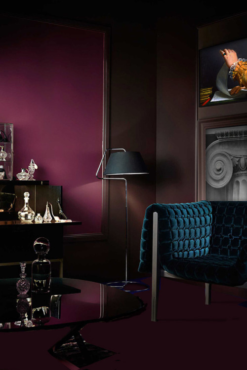
For this month's design shades, we decided to go with the color Burgundy. Not only we think the color burgundy is a great color when it comes to clothing, but we also wanted to find out if it works well when it comes to people's home. As it turns out while doing our research, the color burgundy isn't as common as we thought it was. We are quite surprised because the color red and brown are usually commonly used as a nice color touch, but when it comes to Burgundy, not so much.
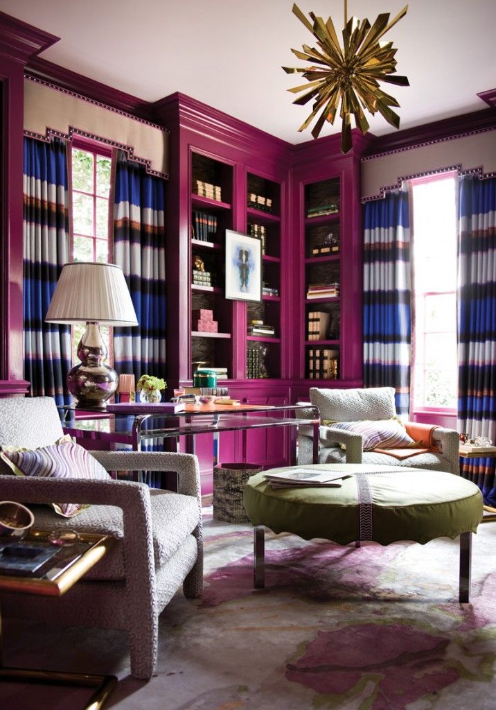
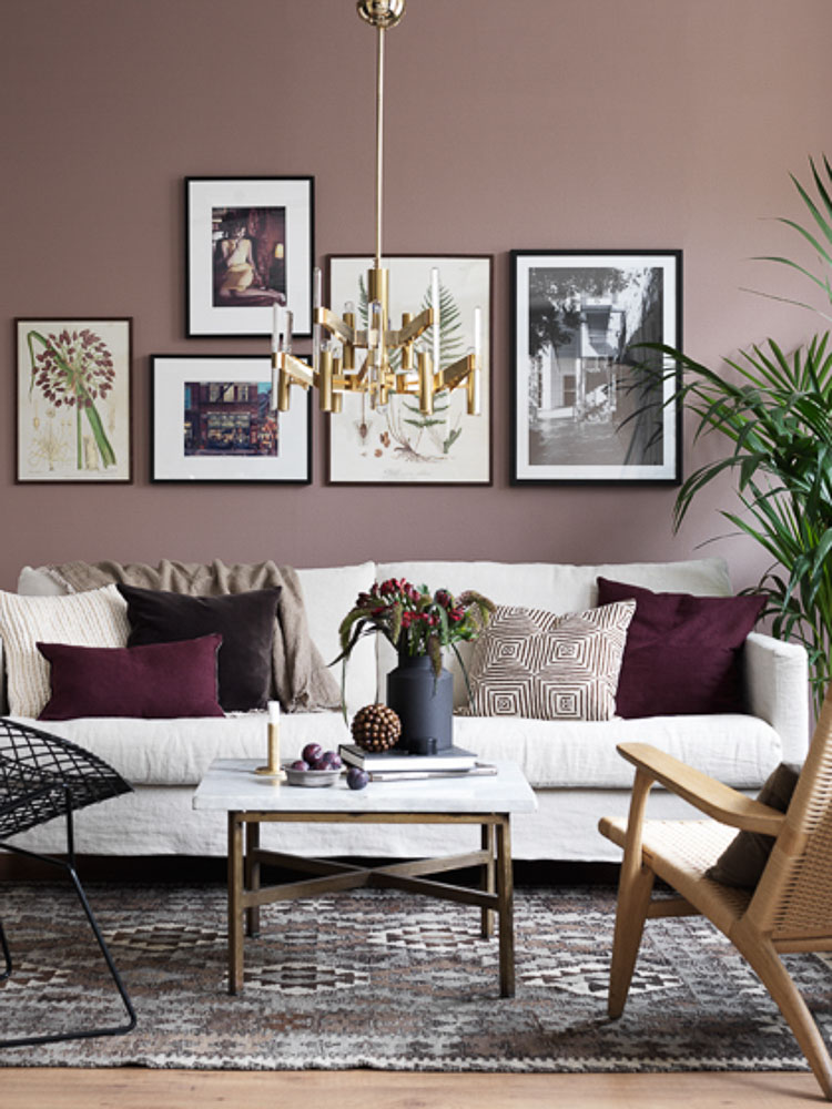
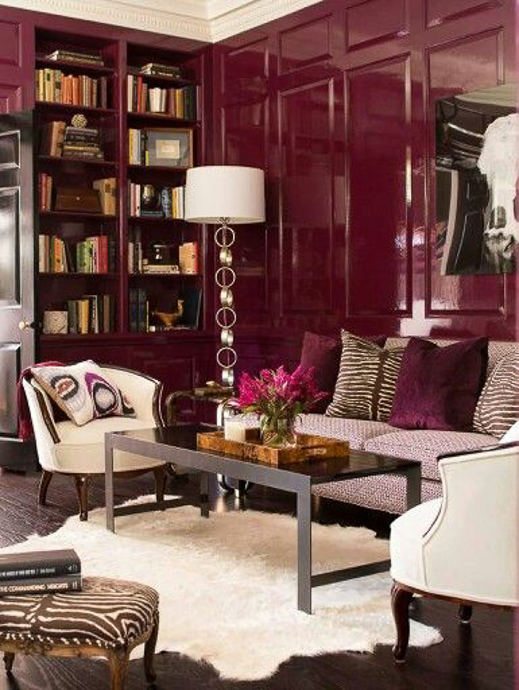
We also find out there are many different representations of the color burgundy. Some may be seen as more reddish and some can be seen are more brownish. Which kind of may us understand why was so hard to find inspiration for this color. Regardless of which tone of burgundy you maybe like or consider burgundy, adding this color to your home is an easy way to make any room stand out and give any room a classic over the top feel.
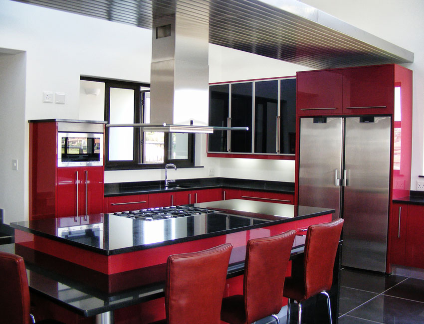
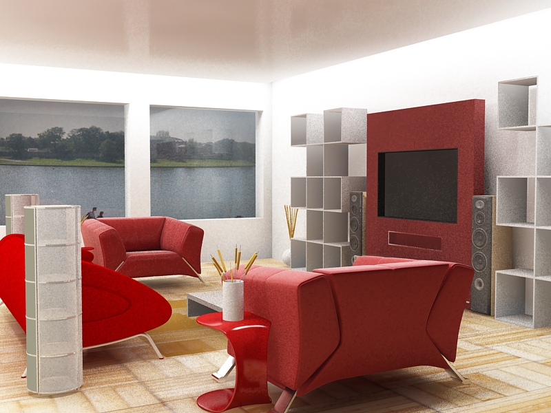
We were able to find a few inspiring photos that we think will explain exactly what we are trying to say by making a room stand out. A top of color is a great way to make a statement and really give a fancy touch as we love here at Javiortiz.com. Whether is the walls, kitchen counters, or just accessories such as a bed cover and pillows, it just takes a small amount of this color to make it's color power come through.
Though this color isn't for everyone, we believe is a great color for temporary decoration and perfect for warm open spaces. Below are a few photos were able to find to inspire your inner designer. That's all for today and we will see you all in our next Design Shades.


No comments:
Post a Comment